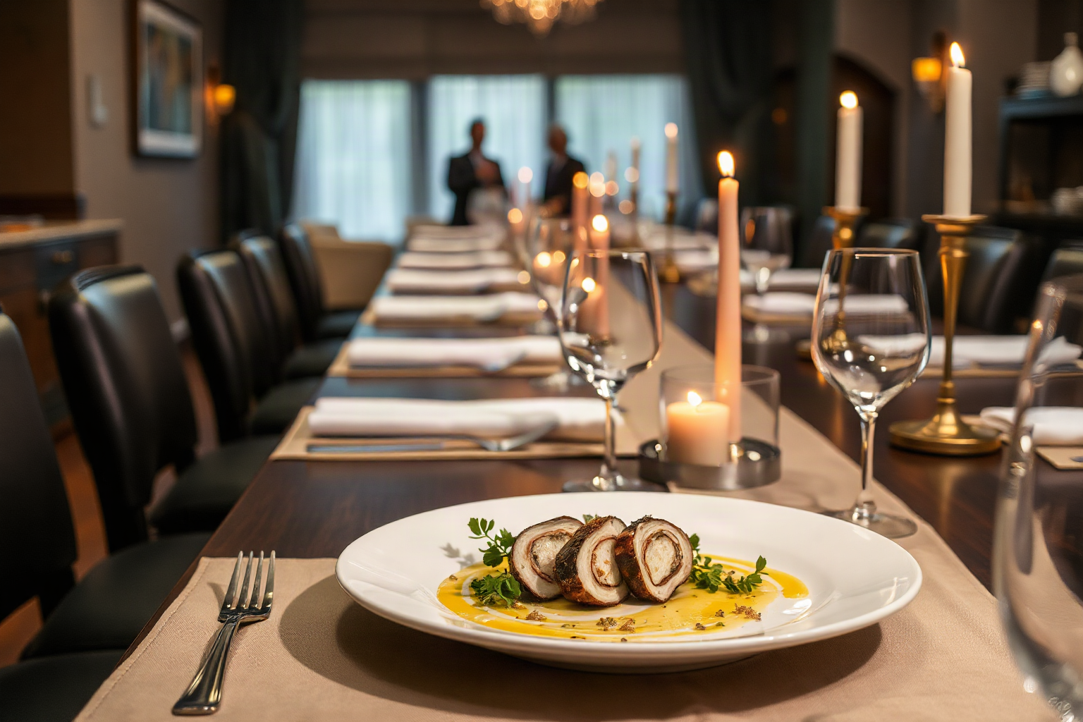
Unique Corporate Events in NJ: A Private Chef Dinner
For a genuinely unique corporate event in NJ, skip the banquet room and book a personal chef. Chef Red Raymundo cooks a multi-course dinner in your office…
Performance nutrition, culinary technique, seasonal ingredients, and the philosophy behind cooking for those who demand excellence.
For a genuinely unique corporate event in NJ, skip the banquet room and book a personal chef. Chef Red Raymundo cooks a multi-course dinner in your office…

See what hiring a personal chef in NJ actually looks like in 2026 — the evening itself, real costs, and how booking works. Read the full guide before you book.

What a personal chef in NJ really does — menus, 2026 pricing and realistic lead times for booking. Compare options and plan your date with confidence.
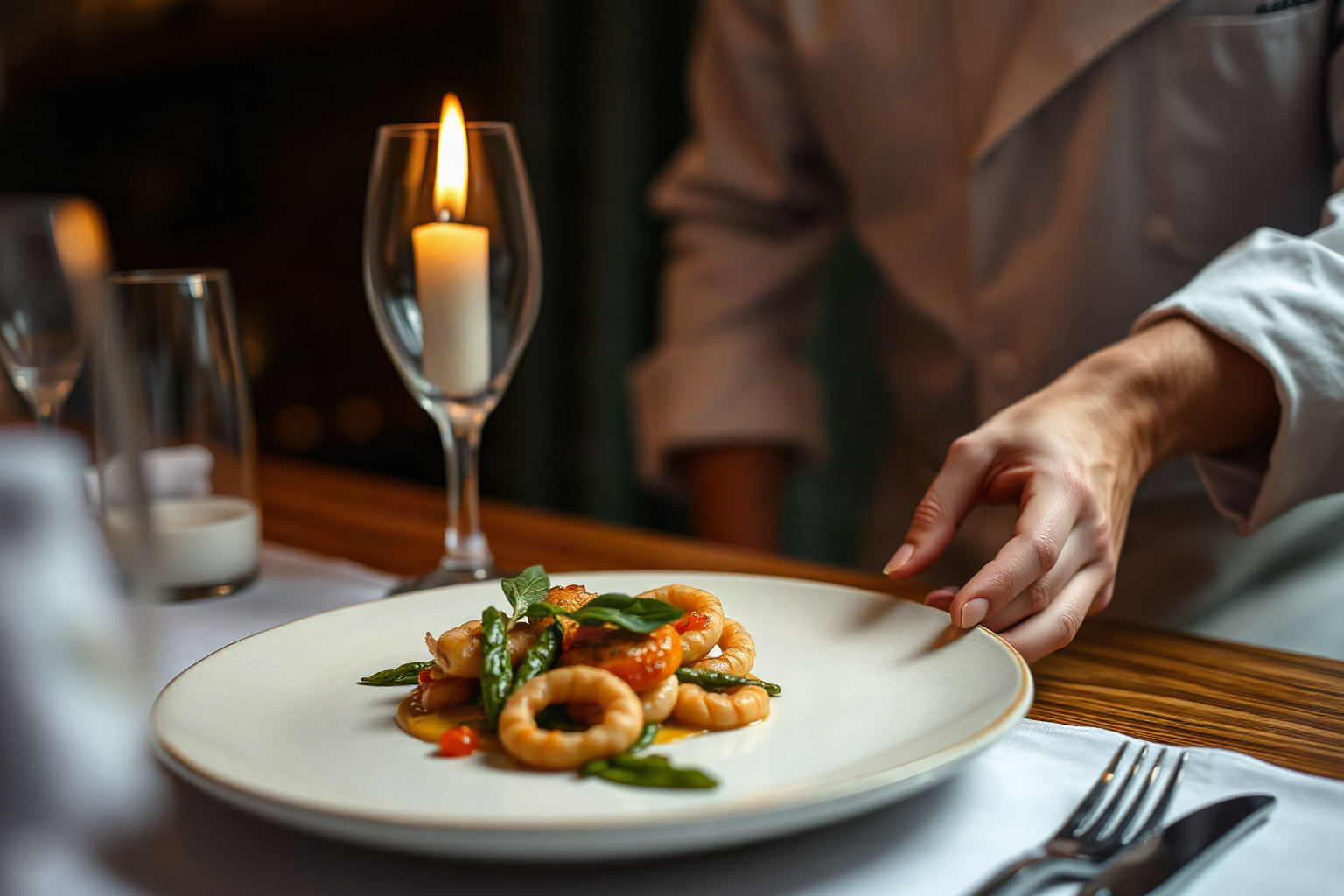
See how luxury private chef NJ evenings come together: menu design, sourcing, course pacing, pricing and clean-up. Book your in-home dinner party in New Jersey.

See how a private chef builds a microbiome-friendly week of meals: fiber diversity, ferments, and resistant starch, tailored to your schedule. Book a consult.

See the healing foods a private chef cooks when you need to recover — slow broths, gentle meals and a week that actually works. Book Chef Red Raymundo.

Whole foods cooking at home, explained by a private chef in New Jersey: pantry basics, component prep and meals that recombine all week. Book a consult.

See what a healthy gut really asks of a working week: the foods that do the heavy lifting, the prep a private chef handles, and how to book. Book your week.

See what a personal chef in Monmouth County costs in 2026, how menus are built, and how booking works in Red Bank, Holmdel and Middletown. Book your date.

A personal chef in Sparta NJ plans seasonal in-home dinner party menus, cooks, serves and cleans up. See how pricing works per guest and reserve your 2026 date.
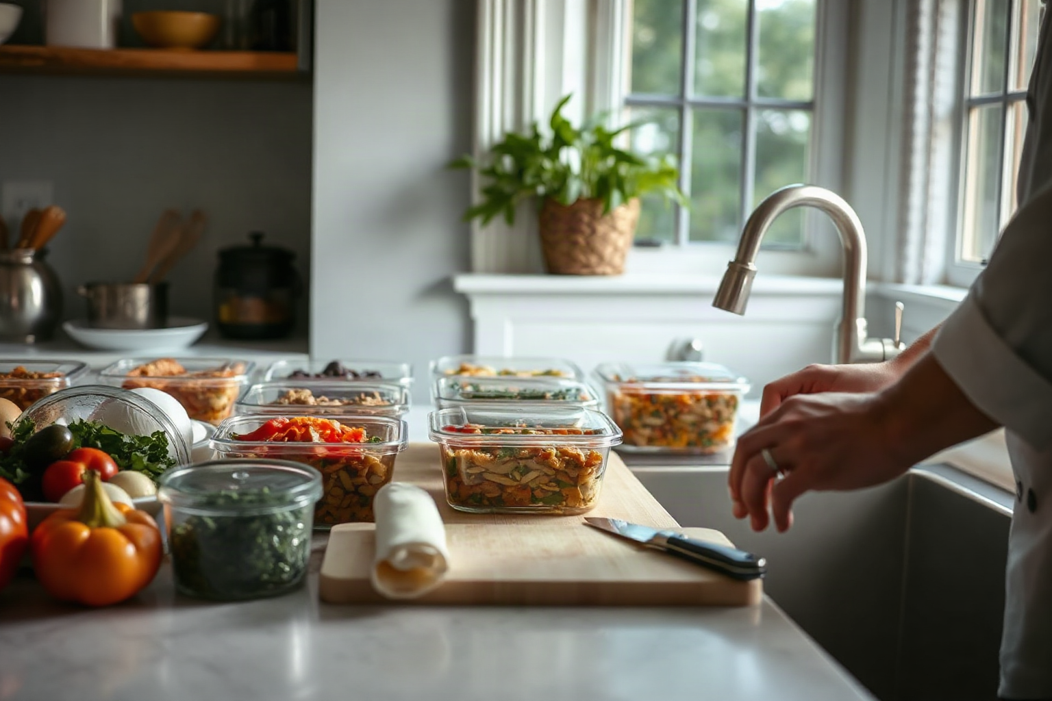
A meal prep chef Morristown NJ families rely on plans, cooks and packs a week of meals in your kitchen. Get menus, costs and booking steps. Book a consult.
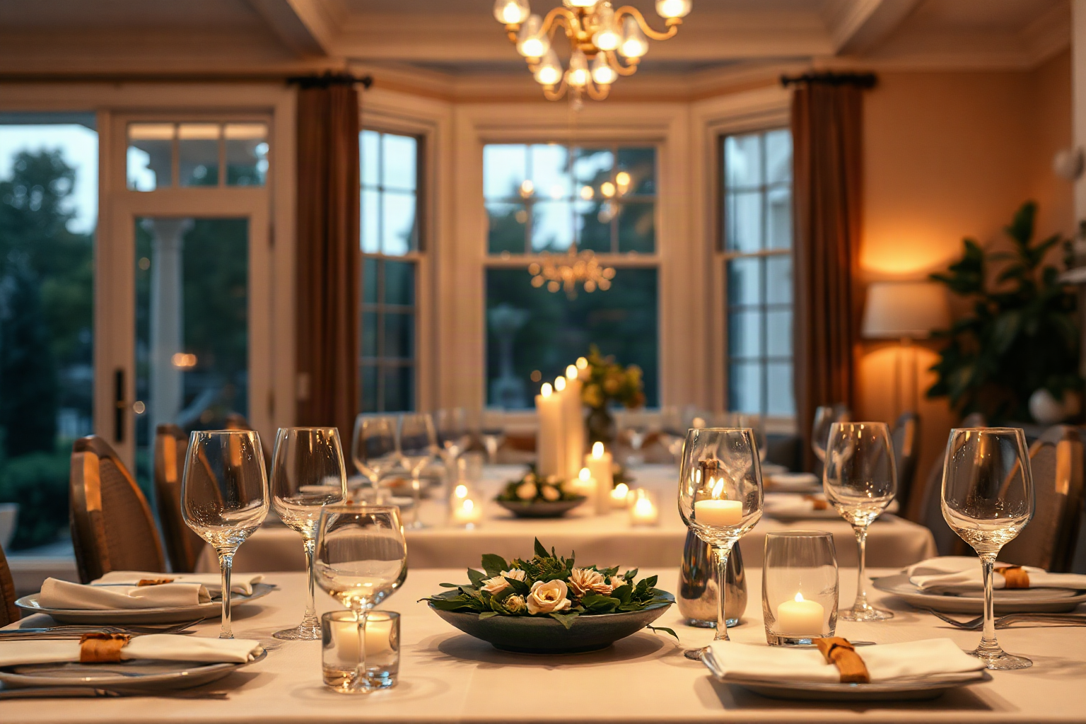
Learn how a private chef in Short Hills NJ plans in-home dinner party menus, what events cost (–5 per person), and how booking works. Reserve early.
Hiring a private chef in Summit NJ? Learn the key questions to ask, what private chef cost looks like, and how menu planning works before you book.

See what a personal chef in Sparta NJ cooks, what dinner costs in 2026 and how booking works — then plan your own in-home dining experience.
See what a private chef in Short Hills NJ really does: custom menus, in-home dinner parties, and restaurant-caliber dining at your own table. Book your evening.

See how a personal chef in Summit NJ works — custom menus, shopping, cooking, and cleanup in your own kitchen. Book restaurant-caliber dining at home.
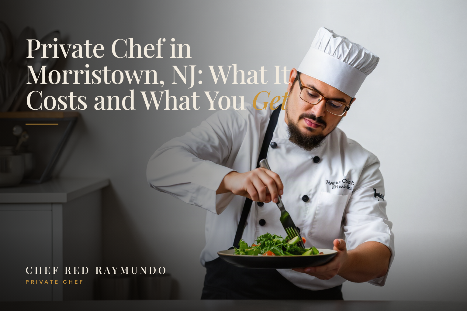
See what a private chef in Morristown NJ costs in 2026, what's included in dinner parties and chef catering, plus how to book your date with confidence.

Hire a personal chef in Hudson County for dinner parties and chef catering at home. See private chef cost, menus, and how to book your 2026 date.

Looking for a personal chef in Burlington County? Chef Red Raymundo brings restaurant-level private chef dining and dinner parties to your NJ home. Book today.

Hire a personal chef in Atlantic County for restaurant-quality in-home dining. See what's included, how booking works, and reserve your date in 2026.
Hire a personal chef in Morris County for dinner parties and chef catering at home. See private chef cost, what's included, and how to book in 2026.

Hire a personal chef in Burlington County for dinner parties, chef catering and private chef service at home. See what's included and book your date.

See how a holiday event private chef in New Jersey works: custom menus, sustainable seafood, and hourly or flat-rate pricing. Book Chef Red for your event.

Discover the differences between a private chef and a personal chef in New Jersey. Learn which service suits your needs and how much to expect in costs.
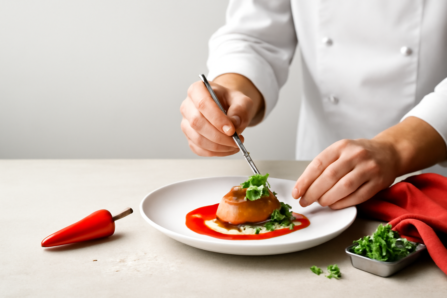
Learn how to hire a private chef in New Jersey in 2026 — costs, vetting tips, menus and booking steps for Morris County and beyond. Book your chef today.

As the temperature drops and evenings grow longer, appetite naturally turns toward warmth, depth, and food that satisfies. Our kitchen has responded with a winter menu built around the season's finest…

Heat, timing, and the Maillard reaction — mastering the fundamentals that separate good from exceptional.

Private Chef for Dinner Parties in Madison, NJ — A Culinary Experience Tailored to You TLDRA private chef service in Madison, NJ, offers bespoke dinner parties with custom menus, full-service executio…

Personal Chef Services in Morristown, NJ — Elevate Your Dinner Routine with Custom Culinary Experiences TLDRPersonal Chef Services in Morristown, NJ — Elevate Your Dinner Routine with Custom Culinary…

Affordable Personal Chef in Denville, NJ — Fresh, Custom Meals Without the Premium Price Tag TLDRAn affordable personal chef service in Denville, NJ, provides fresh, custom meals without premium prici…

Discover how a private chef in New Jersey can boost client retention, team morale, and networking. Elevate your small business hosting in 2026.

Learn how hiring a private chef in New Jersey can elevate your corporate events and client dinners. Discover costs, benefits, and tips for your small business.

Discover why hiring a private chef in New Jersey is a smart investment for busy professionals. Save time, eat well, and boost productivity. Learn more.

Wondering about private chef cost NJ in 2026? Get a full breakdown of pricing factors, average rates, and tips to maximize value for your home dining experience.

Discover 2026 private chef costs in New Jersey, from dinner parties to weekly meal prep. Get real pricing and book your personal chef today.

Discover how a personal chef in Morris County saves time, reduces stress, and delivers restaurant-quality meals at home. Learn the real benefits today.

Hire a private chef for dinner parties NYC and transform hosting into effortless luxury. Discover bespoke menus, costs, and tips for Manhattan homes. Book now.

Discover how a private chef in New Jersey can transform your family meal prep. Save time, eat well, and enjoy stress-free dinners. Book your chef today.

Wondering about private chef cost in NJ? This 2026 guide breaks down pricing, factors that influence rates, and what to expect. Start planning your dinner party today.

Discover how to book chef catering dinner menus in New Jersey. From seasonal ingredients to 2026 trends, this guide helps you impress every guest.

Celebrate birthdays, anniversaries & holiday dinners with a private chef in New Jersey. Enjoy custom menus in your home. Book your 2026 celebration today.

Compare private chef vs traditional catering for your New Jersey event. Learn costs, menu flexibility, and which option fits your dinner party or wedding.

Hire a private chef in New Jersey for your next dinner party. Follow this 2026 step-by-step guide to define your event, find the right chef, and book with confidence.

Discover 2026 menu ideas and booking tips for private chef dinner parties in New Jersey. Elevate your event with expert catering and transparent pricing.

Discover how to hire a private chef in New Jersey in 2026. Learn costs, benefits, and booking tips for dinner parties and catering. Find your chef today.

Private Chef Cost in New Jersey: 2026 Pricing Guide TLDRPrivate Chef Cost in New Jersey: 2026 Pricing Guide The allure of a personal culinary professional in your home has moved from celebrity luxury…

Learn how to hire a private chef in New Jersey for dinner parties and events. Compare costs, find local chefs, and plan your perfect menu in 2026.

Private Chef Essex County NJ: 2026 Local Guide — Elevate Your Home Dining Experience TLDRPrivate chef services in Essex County, NJ, have surged in 2026 as residents seek restaurant-quality meals at ho…

How much does a private chef cost in New Jersey? Explore 2026 hourly rates, per-person fees, and budget tips for dinner parties and chef catering.

Discover 2026 private chef costs in New Jersey for dinner parties and catering. Get transparent pricing and book your chef today.

Discover private chef pricing in New Jersey for 2026. Learn what affects cost, from location to menu, and find the right chef for your budget.

Learn how much chef catering costs in New Jersey in 2026. Compare per-person, flat, and hourly pricing for events. Start planning your menu today.

Learn how to hire a private chef in New Jersey. Compare costs, services, and find the perfect personal chef for dinner parties or weekly meals.

Learn the true cost of hiring a private chef in New Jersey in 2026, from per-meal pricing to monthly retainers. Discover if it fits your budget today.

Learn how to plan a memorable private chef dinner party in New Jersey. From menu to logistics, impress your guests with a curated dining experience.

Discover private chef cost in New Jersey with this complete pricing guide. Compare per-person rates and find your perfect chef today.

Learn how to hire a private chef in New Jersey in 2026. Compare service models, costs, and find the perfect culinary partner for your home.

Learn the real private chef cost in New Jersey for 2026. Discover pricing factors and meal options to fit your budget. Start planning your dinner party today.

Learn how to hire a private chef in New Jersey. This guide covers costs, benefits, and how to choose the perfect chef for dinner parties or daily meals.

Vegan Snack Prep: Healthy Plant-Based Bites Introduction In Dubai's fast-paced environment, finding nutritious snacks that align with a plant-based lifestyle while fitting into a demanding schedule ca…

High-Protein Lunches: Meal Prep Ideas for Busy Professionals Introduction Between back-to-back meetings, client calls, and deadlines, finding time to prepare a nutritious lunch often falls to the bott…

Budget Dinner Meal Prep: Healthy Recipes Under Introduction The rising cost of groceries across the UAE has made cooking nutritious dinners a financial challenge for many households. Yet with stra…

Keto Breakfast Meal Prep: Low-Carb Ideas for the Week Introduction A well-structured keto breakfast meal prep routine can be the difference between staying on track with your nutritional goals and fal…

Freezer Meal Prep: Batch Cooking for Busy Weeks TLDRFreezer meal prep is a strategic approach where you dedicate a few hours weekly to batch cooking, yielding ready-to-heat meals. Key steps include pl…

Discover unique wedding catering ideas for New Jersey couples, from coastal seafood to farm-to-table feasts. Elevate your big day with local flavors.

Compare personal chef vs meal delivery for busy New Jersey families. We break down cost, time, customization, and quality to help you choose the best fit.

Hiring a private chef in New Jersey is more affordable than you think. Discover realistic costs, services, and how to book your chef in 2026.

Discover creative private chef dinner party ideas for New Jersey homeowners. From farm-to-table menus to themed feasts, learn how to impress guests with ease.

Learn how to choose the best chef catering in New Jersey for your event. From private dinners to galas, find the perfect culinary expert for 2026.

Discover private chef costs, menu customization, and scheduling in NJ. Learn how a personal chef simplifies dinner parties and daily meals. Start here.

Discover quick healthy breakfast ideas for kids that are fast, nutritious, and kid-approved. Fuel your child's day with easy meals they'll love.

Discover how to build a freezer meal inventory that supports recovery and simplifies mealtime. Get Chef Red Raymundo's expert tips for nourishing your family.

Discover quick healthy breakfast ideas for kids that save time and fuel their day. Get kid-approved meals your family will love.

Discover easy one-pot pasta recipes for weeknights that save time and cleanup. Get restaurant-quality results with minimal effort. Perfect for busy families.

Discover seasonal farmers market cooking ideas that turn fresh local produce into memorable meals. Elevate your kitchen with Chef Red Raymundo's expert tips.

Learn how to plan a kids birthday party menu at home with tips on taste, dietary needs, and easy prep. Make your child's celebration memorable today.

Learn expert wine pairing tips for home dinner parties. Elevate your evening with practical advice on food and wine harmony from private chef Red Raymundo.

Discover budget-friendly dinner party ideas for hosting at home. Learn strategic menu planning tips that impress guests without breaking the bank.

Discover easy meal prep tips for busy families in New Jersey. Save time, reduce stress, and enjoy nutritious meals. Learn how a personal chef can help.

Explore private and personal chef services in Morris County, NJ. Custom menus, local ingredients, and cost-effective in-home dining. Elevate your next meal today.

Private Chef in Union County NJ — Elevate Your Home Dining Experience TLDRPrivate chef and personal chef services in Union County, NJ, offer customized in-home dining experiences, including dinner par…

Discover the luxury of private chef dining at home in New Jersey. Learn how in-home experiences elevate entertaining. Book your personalized chef today.

Experience restaurant-caliber dining at home with a private chef in Morris County, NJ. Custom menus, local ingredients, and full-service catering. Book your experience today.

Discover 2026 private chef costs in New Jersey, from base rates to menu tiers. Learn what factors influence pricing and how to budget for your in-home dining experience.

Discover how to hire a private chef in New Jersey for dinner parties, events, or weekly meals. Learn costs, menu planning & etiquette in this complete guide.

Our Full Menu & Service Guide TLDROur private chef services in New Jersey offer three service models: full-service dinner parties, weekly meal preparation, and event catering for groups up to 200…

What Does a Private Chef Cost in NJ? A Transparent Breakdown TLDRWhat Does a Private Chef Cost in NJ? A Transparent Breakdown Introduction Hiring a private chef in New Jersey is no longer reserved exc…

Catering vs Private Chef: Which Is Right for Your NJ Event? TLDRCatering vs Private Chef: Which Is Right for Your NJ Event? Introduction Planning an event in New Jersey comes with a host of decisions…

Find the Best Personal Chef Near Me in Morris County NJ TLDRA personal chef in Morris County, NJ, provides customized meal preparation, special event catering, and dietary-specific plans using fresh l…

How Much Does a Private Chef Cost in Morris County NJ? TLDRPrivate chef costs in Morris County, NJ vary: hourly rates –0, per-person –5, flat event fees 0–
,500+. Weekly meal prep for…
A private chef in Morris County NJ brings restaurant-quality meals to your home. Custom menus, weekly prep, and full cleanup for busy families. Book your consultation today.

Private Chef Monmouth County: Fresh Menus for Busy NJ Families Introduction For families throughout Monmouth County, the daily challenge of preparing nutritious, delicious meals while managing packed…

Discover how a private chef in Bergen County brings restaurant-quality meals to your home. Custom menus, flexible schedules, and stress-free dining for NJ families.

Private Chef NJ: Fresh, Custom Menus for Busy Families TLDRPrivate Chef NJ: Fresh, Custom Menus for Busy Families Introduction The evening scramble to prepare a nutritious dinner while managing homewo…

Discover why New Jersey homeowners hire a private chef for dinner parties. Elevate your next event with personalized, in-home dining. Book your chef today.

Private Chef NYC: Elevate Your Dinner Parties with a Personal Chef Introduction The art of hosting has evolved significantly in New York City, where discerning hosts are increasingly turning to privat…

Private Chef New Jersey: Elevate Your Home Dining Introduction Imagine stepping into your own home after a long day, only to be greeted by the aromas of a professionally prepared, multi-course meal cr…

Private Chef NJ: Why the Tri-State Chooses In-Home Dining TLDRPrivate Chef NJ: Why the Tri-State Chooses In-Home Dining The demands of Tri-State living—long commutes, packed schedules, and a deep appr…

Discover Project Cardamom recipes from a private chef New Jersey hosts love. Elevate your dinner parties with personalized menus crafted for you. Book today.

Discover the benefits of hiring a private chef in New Jersey. Enjoy bespoke menus, effortless entertaining, and gourmet dining in your own home.

Luxury Private Dining at Home: Gourmet Chef Experience in NJ, NY & CT TLDRLuxury Private Dining at Home: Gourmet Chef Experience in NJ, NY & CT Introduction The art of entertaining has evo…

Private Chef Services in NJ: The Complete Guide TLDRPrivate Chef Services in NJ: The Complete Guide Introduction Imagine walking through your front door after a long day to find a perfectly seared fil…

Personal Chef for Events in NJ, NY & CT: Elevate Your Gathering with Bespoke Culinary Experiences TLDRExplore how hiring a personal chef for events in NJ, NY, and CT transforms gatherings with cus…

Weekly Meal Prep with a Personal Chef: Simplify Your Life TLDRWeekly Meal Prep with a Personal Chef: Simplify Your Life Between demanding careers, family obligations, and the constant buzz of daily li…

Special Diet Private Chef: Custom Menus for Your Health Goals TLDRSpecial Diet Private Chef: Custom Menus for Your Health Goals Navigating the world of specialized nutrition while managing a busy life…

Host an unforgettable private event with a personal chef in Dubai. Learn about costs, bespoke menus, and how to elevate your gathering in 2026.

Discover how personal chef services in Sussex County, NJ elevate home dining in 2026. Learn about private chef costs, dinner parties, and catering. Book your chef today.

Discover how personal chef services in Passaic County, NJ bring restaurant-quality meals to your home. Learn the benefits and process to elevate your dining experience.

Explore personal chef services in Hudson County, NJ. From dinner parties to weekly meals, learn costs and benefits. Elevate your dining at home today.

Discover personal chef services in Ocean County, NJ. From dinner parties to weekly meals, enjoy customized catering at home. Book your private chef today.

Explore personal chef services in Middlesex County, NJ for customized menus, dinner parties, and weekly meal prep. Elevate your dining experience today.

Discover how a personal chef in Essex County, NJ can transform home dining. Explore benefits, costs, and service models for busy households.

Discover how personal chef services in Bergen County offer customized, restaurant-quality meals at home. Learn about costs, menus, and benefits in 2026.

Discover personal chef services in Monmouth County, NJ. Save 10-15 hours weekly with custom meals from 0 per session. Elevate your dining at home.

Top Private Chef Services in Union County, NJ TLDRTop Private Chef Services in Union County, NJ Introduction As dining preferences continue to evolve in 2026, more Union County residents are discoveri…

Top Private Chef Services in Sussex County, NJ: Elevating Your Culinary Experience TLDRPrivate chef services in Sussex County, NJ offer personalized, on-site dining experiences that differ from tradit…

Top Private Chef Services in Ocean County, NJ TLDRTop Private Chef Services in Ocean County, NJ Introduction For residents of Ocean County, New Jersey, the dining landscape has evolved far beyond rest…

Top Private Chef Services in Salem County, NJ TLDRTop Private Chef Services in Salem County, NJ Introduction In an era where dining experiences are increasingly valued for their personalization and ex…

Top Private Chef Services in Passaic County, NJ TLDRTop Private Chef Services in Passaic County, NJ In an era where time is the ultimate luxury, discerning residents of Passaic County are increasingly…

Top Private Chef Services in Warren County, NJ TLDRLearn about private chef services in Warren County, NJ, including types of services, how to select a chef, pricing, and benefits for corporate events…

Top Private Chef Services in Camden County, NJ TLDRTop Private Chef Services in Camden County, NJ Introduction Camden County's culinary landscape has evolved dramatically, with discerning homeown…

Top Private Chef Services in Cumberland County, NJ TLDRTop Private Chef Services in Cumberland County, NJ The demand for personalized dining experiences has grown significantly across New Jersey, and…

Top Private Chef Services in Gloucester County, NJ TLDRTop Private Chef Services in Gloucester County, NJ Introduction The demand for private chef services in Gloucester County, New Jersey, has surged…

Top Private Chef Services in Cape May County, NJ TLDRTop Private Chef Services in Cape May County, NJ When the salt air blends with the aroma of a perfectly seared filet, you know you've found so…

Top Private Chef Services in Somerset County, NJ TLDRTop Private Chef Services in Somerset County, NJ Introduction Somerset County, New Jersey, has long been celebrated for its picturesque landscapes…

Top Private Chef Services in Burlington County, NJ TLDRTop Private Chef Services in Burlington County, NJ Burlington County, New Jersey, has become a sought-after destination for residents who value c…

Top Private Chef Services in Atlantic County, NJ TLDRAn exploration of premier private chef services in Atlantic County, NJ, covering types of services, hiring considerations, and industry trends. Int…

Top Private Chef Services in Mercer County, NJ TLDRTop Private Chef Services in Mercer County, NJ Introduction The culinary landscape of Mercer County, New Jersey, has evolved significantly, with disc…

Top Private Chef Services in Hudson County, NJ TLDRTop Private Chef Services in Hudson County, NJ In an era where convenience meets culinary excellence, private chef services have emerged as a transfo…

Top Private Chef Services in Morris County, NJ TLDRA comprehensive guide to private chef services in Morris County, NJ, covering the rise of private dining, what to expect, how to select a chef, custo…

Top Private Chef Services in Middlesex County, NJ TLDRTop Private Chef Services in Middlesex County, NJ Introduction The dining landscape in Middlesex County has undergone a remarkable transformation…

Top Private Chef Services in Bergen County, NJ TLDRA guide to private chef services in Bergen County, NJ, covering demand, what sets exceptional chefs apart, services offered, how to select a chef, co…

Top Private Chef Services in Monmouth County, NJ TLDRTop Private Chef Services in Monmouth County, NJ Introduction Monmouth County, New Jersey, has long been a destination for those who appreciate fin…

Top Private Chef Services in Essex County, NJ TLDRGuide to private chef services in Essex County, NJ, covering types, selection, costs, and FAQs. Introduction The culinary landscape of Essex County, N…

Personal Chef Services Across New Jersey — Complete Area Guide Introduction New Jersey's diverse culinary landscape spans from the farm-rich countryside to bustling urban centers, creating a unique de…

Explore how personal chef services in Union County, NJ offer customized dining. Save time with a private chef. Discover the new standard for home meals today.

Discover personal chef services in Salem County, NJ. Chef Red Raymundo offers custom dining for dinner parties and busy families. Book your chef today.

Discover personal chef services in Gloucester County, NJ for dinner parties, catering, and weekly meals. Learn private chef costs and how to hire in 2026.

Discover personal chef services in Cape May County, NJ. Enjoy restaurant-quality dining at home. Book your private chef experience today.

Discover personal chef services in Camden County, NJ. Enjoy custom culinary experiences for dinner parties, daily meals, and special events with affordable chef catering.

Discover private chef services in Mercer County, NJ. Learn costs, customization, and how to find the perfect personal chef for dinner parties and more.

Discover the benefits of hiring a personal chef in Warren County, NJ. Learn about costs, customization, and how to elevate your dining at home in 2026.

Discover private chef services in Burlington County, NJ. Learn costs, benefits, and how a personal chef elevates dinner parties and daily dining in 2026.

Elevate home dining with personal chef services in Somerset County, NJ. Enjoy customized meals, convenience, and culinary excellence. Discover your chef today.

Discover personal chef services in Atlantic County, NJ. Chef Red Raymundo offers bespoke menus for dinner parties and more. Elevate your dining in 2026.

Discover how hiring a personal chef in Bergen County, NJ saves time, elevates dining, and fits your budget. Learn chef costs and benefits today.

Hire a personal chef in Atlantic County, NJ for restaurant-quality meals at home. Learn about costs, customization, and how to choose the best chef for you.

Discover the rise of personal chefs in Essex County, NJ. Learn about private chef costs, dinner parties, and catering dinner services in 2026.

Discover the value of hiring a personal chef in Camden County, NJ. Learn how private chef services save time, cater to dietary needs, and elevate dining at home.

Discover the value of hiring a personal chef in Cape May County, NJ. Enjoy fresh local seafood and farm-to-table dining. Book your private chef today.

Discover how a personal chef in Burlington County, NJ saves time, reduces stress, and elevates dining. Explore services, costs, and quality of life benefits.

Discover the value of a personal chef in Cumberland County, NJ. Save time, enjoy custom meals, and elevate dining at home. Explore private chef services today.

Discover the cost, benefits, and process of hiring a personal chef in Middlesex County, NJ. Get chef catering for dinner parties and busy weeknights.

Discover how hiring a personal chef in Union County, NJ can transform your evenings. Enjoy chef-crafted meals at home. Explore the benefits and costs today.

Hire a personal chef in Warren County, NJ for customized meals, time savings, and value. Discover how Chef Red Raymundo transforms your home dining experience.

Discover how a personal chef in Monmouth County, NJ, saves time and elevates home dining. Learn costs and benefits for busy families and professionals in 2026.

Discover how a personal chef in Sussex County, NJ saves time and elevates daily dining. Enjoy chef-crafted meals without the stress of planning and prep.

Hire a personal chef in Morris County, NJ for customized meal prep, dinner parties & seasonal menus. Transform your home dining experience today.

Discover how a personal chef in Salem County, NJ saves you time and delivers healthful, tailored meals. Transform your weekly routine today.

Discover the value of a private chef in Gloucester County, NJ. Enjoy restaurant-quality dinner parties at home. Learn about chef costs and catering today.

Discover the value of a private chef in Ocean County, NJ. Reclaim your evenings with gourmet meals tailored to your taste. Book your chef today.

Discover the cost & benefits of hiring a private chef in Passaic County, NJ. Enjoy personalized dinner parties & chef catering. Transform your dining experience today.

Discover why hiring a personal chef in Hudson County, NJ is the ultimate lifestyle upgrade in 2026. Save time, enjoy gourmet meals, and transform dinner.

Discover personal chef services in Cumberland County, NJ. Enjoy customized menus, time savings, and gourmet dining at home. Elevate your meals today.

Discover how a personal chef in Hunterdon County, NJ elevates home dining with custom menus. Learn costs, benefits, and how to book your chef today.

Discover the benefits of hiring a personal chef in Mercer County, NJ. Learn about cost, health perks, and how to choose the right chef for your home.

Discover how a personal chef in Somerset County, NJ can transform your meals. Save time, enjoy gourmet dining at home. Explore chef catering options today.

Discover how personal chef services in Morris County, NJ, elevate home dining in 2026. Explore chef costs, dinner parties, and private chef options—book yours today.

Learn the private chef cost in New Jersey, from –0 per person for dinner parties to 0–0 for weekly meal prep. Get pricing tips and book your chef today.

Discover why hiring a private chef in New Jersey saves time, offers personalized meals, and elevates entertaining. Learn the benefits and costs today.

Discover what a private chef does, from dinner parties to weekly meal prep. Explore services, benefits, and costs. Book Chef Red Raymundo in NJ, NY, and CT.

Wondering about chef cost for your event? Our 2026 guide breaks down hourly, per-event, and monthly pricing. Find your perfect private chef today.

Discover why hiring a private chef in New Jersey is the ultimate luxury. From personalized menus to stress-free entertaining, learn how to elevate your dining at home.

Discover how a private chef makes hosting dinner parties effortless. Plan your stress-free event in NJ, NY, or CT today.

Discover how chef catering transforms corporate galas, weddings, and private dinners in NJ, NY, and CT. Book Chef Red Raymundo for an unforgettable culinary experience.

Explore versatile catering dinner services for corporate events, weddings, and private celebrations in NJ, NY, and CT. Chef Red Raymundo offers tailored in-home dining. Book now.

Find the best personal chef in New Jersey with our comprehensive guide. Learn to assess needs, verify credentials, interview candidates, and build lasting culinary partnerships.

Master the art of hosting dinner parties with expert tips on planning, menus, and ambiance. Perfect for New Jersey, New York, and Connecticut hosts. Read more.

Discover the best private chef New Jersey services for farm-fresh, personalized dining. Elevate your events with expert culinary artistry. Book your chef today!

Discover the top benefits of hiring a personal chef in New Jersey, New York, and CT. Save time, eat healthy, and enjoy custom meals. Book your chef today.

Wondering about private chef cost in NJ, NY, or CT? Get a transparent pricing breakdown and budget tips to enjoy chef catering without surprises.

Wondering about private chef costs in 2026? From /hr dinners to monthly meal prep, see pricing tiers for New Jersey, New York & Connecticut.

Curious what a private chef does? From meal prep to dinner parties, discover how Chef Red Raymundo serves NJ, NY & CT. Book your personalized experience today.

Enjoy fresh, restaurant-quality meals at home with a personal chef in CT. Tailored menus, local ingredients, and hassle-free dining. Book your chef today!

Discover how personal chef services in New York transform home dining. Enjoy custom menus, save time, and impress guests. Book your chef today.

Discover everything about hiring a personal chef in New Jersey: costs, services, and how to choose the right chef for unforgettable home dining.

Discover how personal chef special diets New Jersey services transform home dining. Customized meals for allergies, chronic conditions & lifestyle preferences. Book your chef today.

Compare personal chef NJ vs meal delivery for cost, convenience & taste. Discover which option delivers real value for your New Jersey kitchen.

Discover the best personal chef Northern New Jersey services. From Bergen to Morris County, enjoy restaurant-quality meals at home. Find your chef today.

Hire a personal chef for events in NJ for bespoke dining, dietary flexibility, and unforgettable gatherings. Discover the value and book your chef today.

Learn how to become a personal chef in New Jersey with expert tips on certification, business setup, and client building. Start your culinary career today.

Learn the average cost of hiring a personal chef in New Jersey. Get pricing tiers, key factors, and tips to find the right chef for your budget.

Considering a personal chef in New Jersey? We answer the top 10 questions about cost, services, and benefits. Get the facts to decide if it's right for you.

Discover what a personal chef does in New Jersey. From meal prep to dinner parties, learn how a private chef can save time and elevate your dining experience.

Discover the real private chef cost in New Jersey, from hourly rates to full event packages. Get a personalized in-home dining experience starting at /hr.

Hire a chef for a night and enjoy a stress-free, gourmet celebration at home. Perfect for parties in New Jersey. Book your private chef experience today.

Discover how chef catering transforms your event with custom menus and five-star flair. Book a personal chef in New Jersey for a memorable dining experience.

Experience intimate private dining at home with Chef Red Raymundo in NJ, NY & CT. Bespoke menus, full service. Book your unforgettable evening today.

Discover the benefits of an in-home chef for unmatched convenience, healthier meals, and everyday luxury. Elevate your lifestyle with personalized culinary experiences.

Looking for a private chef near you? Learn how to find, compare costs, and book the best chef for hire in New Jersey, New York, and Connecticut.

Discover the top reasons to hire a personal chef in NJ. Save time, eat better, and enjoy custom meals at home. Learn how it works and book your chef today.

Discover how personal chef services can revolutionize your meals. Chef Red Raymundo brings restaurant-quality dining to your home in NJ, NY, and CT. Book now.

Learn how to hire a personal chef in New Jersey. Compare costs, services, and find the perfect chef for your home. Start your culinary journey today.

Transform your event with a private dining chef in New Jersey. Enjoy custom menus, live cooking, and higher guest satisfaction. Book Chef Red Raymundo today.

Discover how an in-home chef in New Jersey saves time, improves nutrition, and offers restaurant-quality meals. Transform your family dinners today.

Discover the best personal chef services in New Jersey for dinner parties, events & more. From pricing to menus, find your perfect chef today.

Learn to source sustainable seafood as a home cook. Master labels, ask smart questions, and cook with confidence to protect our oceans. Start today.

Discover how to find the best personal chef in New Jersey. Learn to vet candidates, compare costs, and enjoy private chef dining at home.

Discover how much a personal chef costs in New Jersey in 2025. From meal prep to full-service, get transparent pricing for busy professionals and parents.
Discover why hiring a personal chef in New Jersey saves time, offers custom meals, and often costs less than dining out. Enjoy chef-quality meals at home today.

Learn the real private chef cost New Jersey, NY & CT. From /hr to event packages. Get transparent pricing & budget tips for your area.

Compare private chef vs catering for NYC dinner parties. Discover which delivers better personalization, experience, and value for your event.

Learn how to hire a private chef in New Jersey for your next dinner party. Get tips on costs, menus, and finding the perfect chef for your home event.

Heat, timing, and the Maillard reaction — mastering the fundamentals that separate good from exceptional.

The meal timing, macros, and specific foods that consistently produce peak performance on game day.

Why the world's healthiest and happiest populations have been eating the same way for centuries — and what we can learn from them.

High-protein, anti-inflammatory, and genuinely stunning. The dish I've prepared more times than any other for my clients.

The foods, preparation methods, and daily habits that actively reduce inflammation — and why this matters more than any supplement.